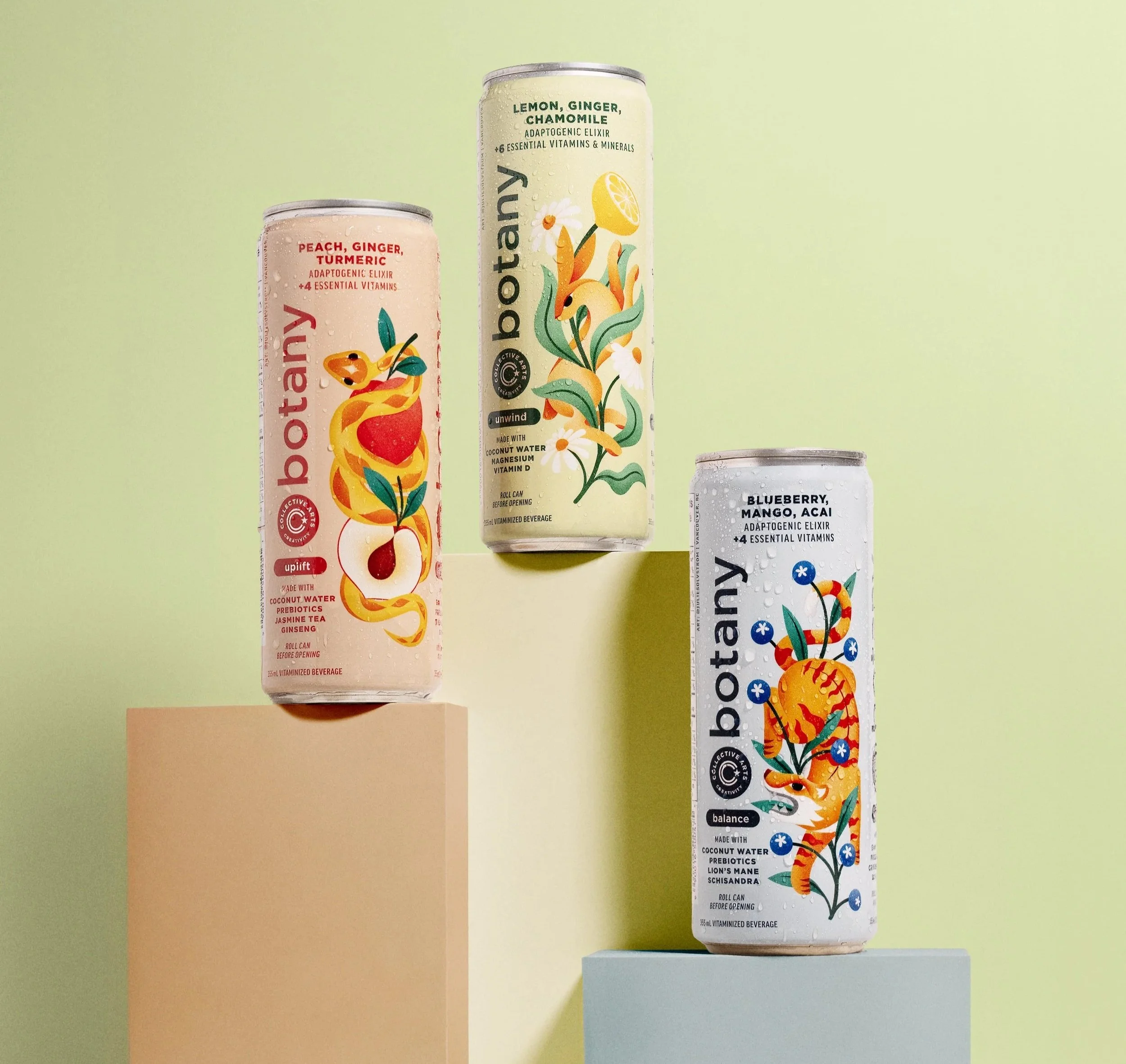
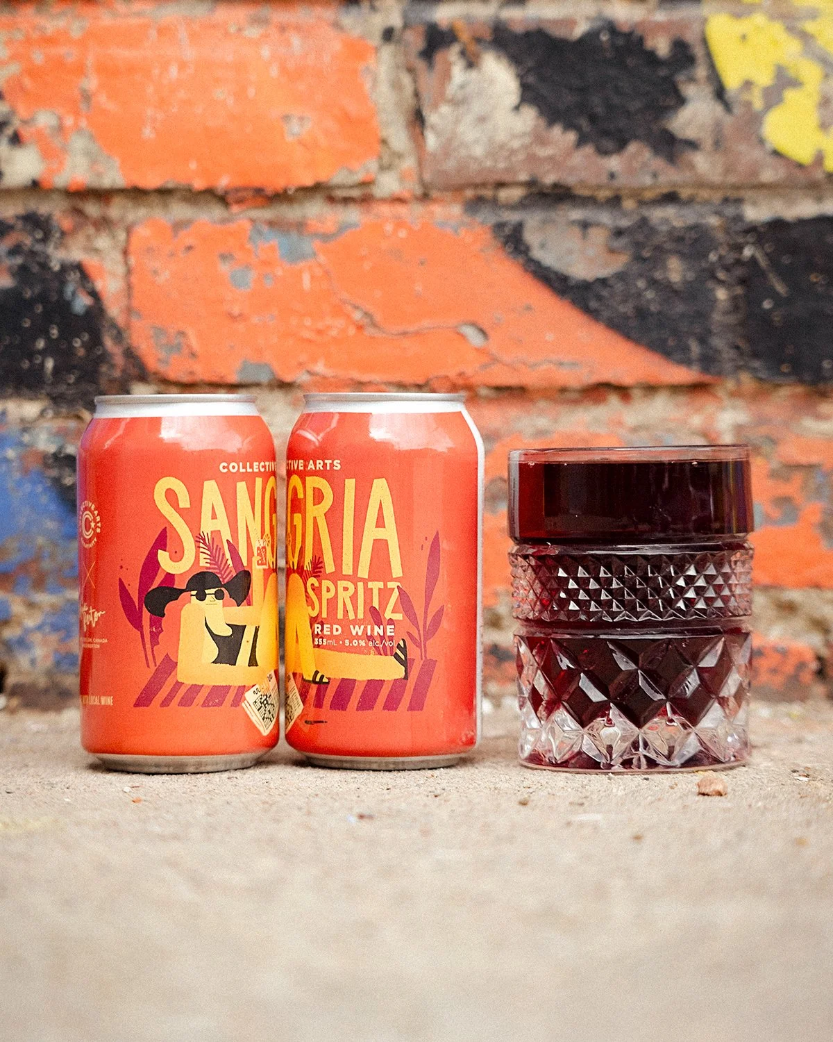
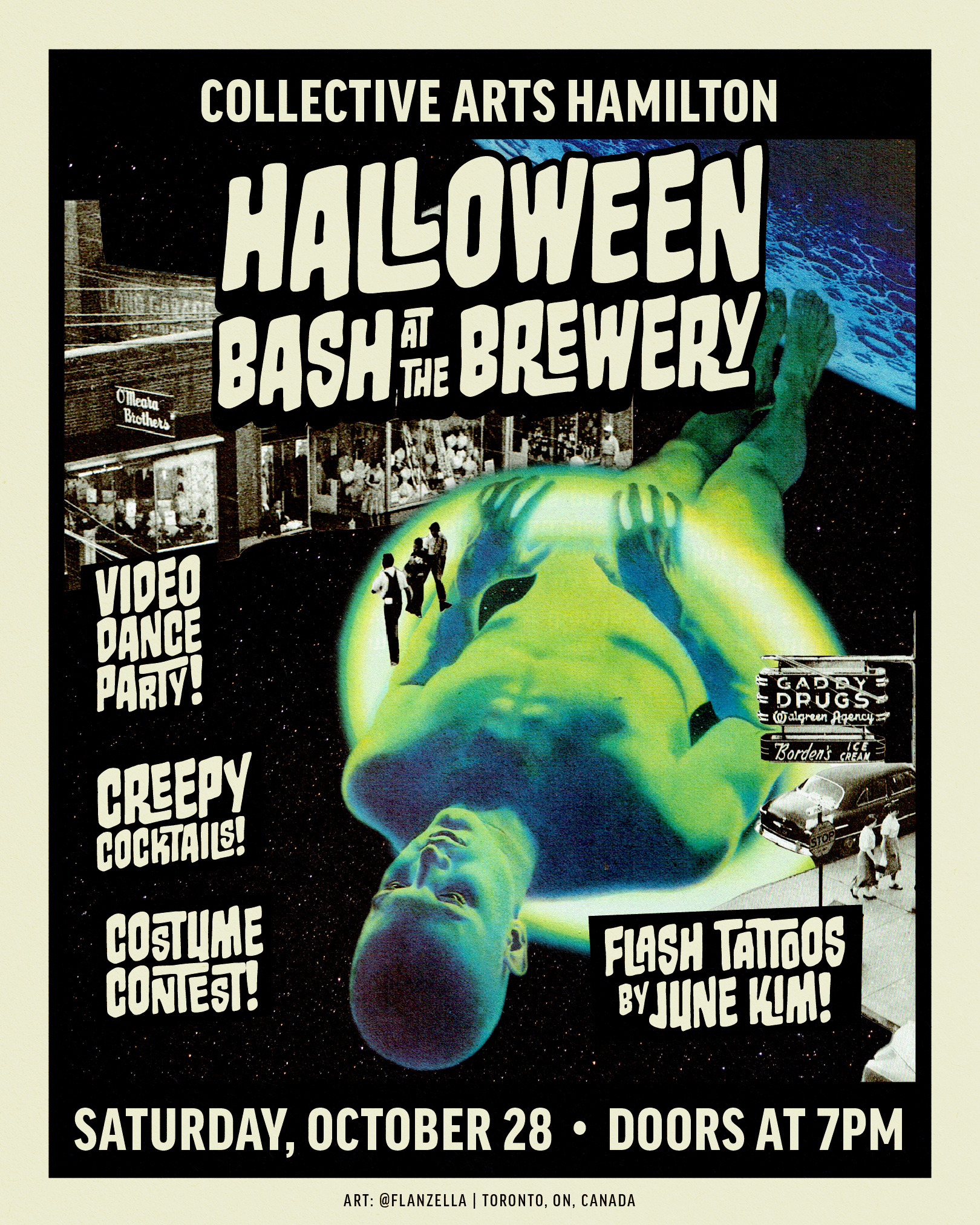
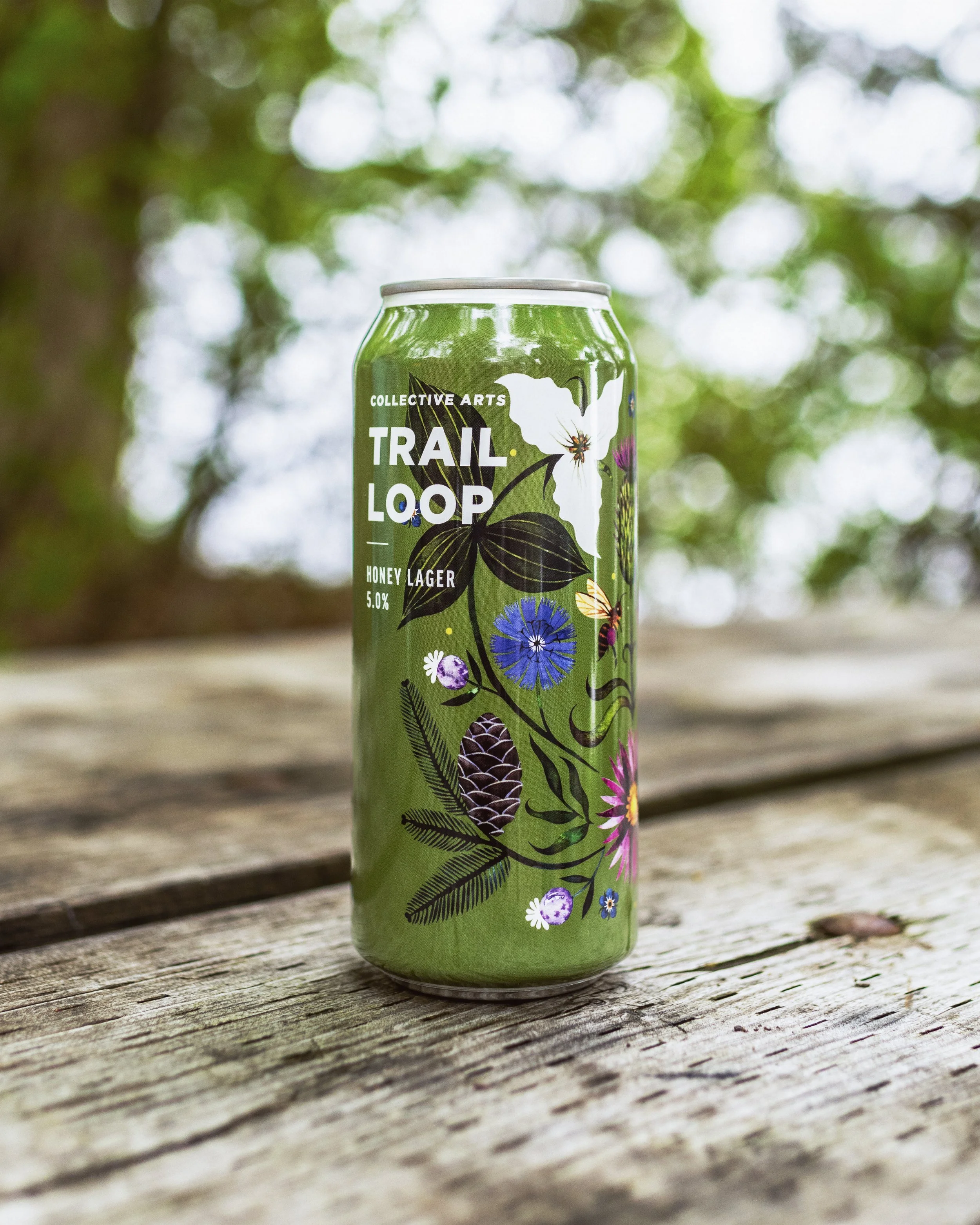
With changes in the photography industry, the Henry’s brand needed to go through a transformation. Henry’s chose to communicate the company’s new direction with a booklet for employees on the front line and in head office.
Copy and some rough illustration concepts were provided by the Henry’s Marketing VP. I refined those concepts and illustrated and laid out the type on each page.
KCFF needed a campaign to advertise the 13th year of the festival. I illustrated a cut-paper style person made out of Kingston landmarks to connect to the idea of community in the festival. My concept unfortunately was not ultimately selected, but it was fun to work on anyway.
Packaging made for Cameron, Henry’s in-house brand of camera accessories. The photography and brand direction were provided by the Henry’s creative manager. I laid out the assets on to the die line provided by the manufacturer and ensured that the files were print-ready.
Designed as part of a campaign to re-introduce BLACKS film, slide, and photo scanning services. The brochure outlines the available services and prices for customers to take home.
A few years ago, Henry’s expanded their business out to the west coast for the first time. One of the ways they decided to get the word out about their new location in Victoria, BC was to print a brochure for Tourism Victoria. The idea was to give tourists a rundown of some popular spots in the city to take great photographs, while plugging Henry’s as well of course.
I illustrated some icons for the front cover and laid them out in a way that was inspired by some vintage map designs. I used Snazzy Maps to customize the map of Victoria in Henry’s colours. The copy describing each location was also written by me.
This magazine ad was designed to communicate the Henry’s brand to some of their less traditional customers. The concept came from the Henry’s Creative Director, and was then executed by me. The building and car illustrations came from a stock vector and were adjusted to work better with the Henry’s brand. I then added the map icons, trees, and street layout. This ad was also adjusted to work for Henry’s brand in the province of Quebec, Lozeau.
Several times a year, Henry’s releases a flyer filled with deals for shoppers to peruse. Sometimes there is a print version handed out with the newspaper, other times it only exists digitally on flyer websites like Flipp and Reebee. With the assistance of the Creative Director, I was recently able to convince the Purchasing and Marketing teams that the flyer should focus a lot more imagery and bigger product images, and less text describing products that people probably weren’t reading. These pages are a result of that redesign.
We wanted to increase engagement on the Henry’s and Lozeau Instagram pages. We figured some fun templates would be a great way to get customers to share our posts more often. We were right, and engagement went way up immediately!